By looking at designs as two-dimensional shapes, we can test for two
common compositional problems: empty space and crowded space.
Empty
Space
The feeling of empty space is a
signal from your subconscious that the spatial relationships are out of balance.
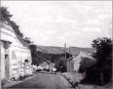
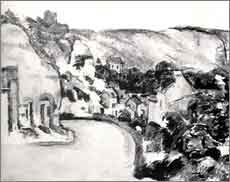
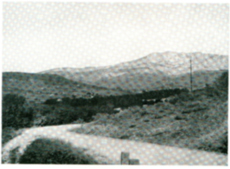
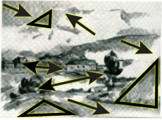
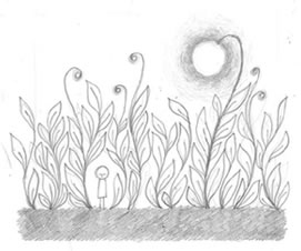
Take a look at the landscape photo (below-left). There is a vast
empty space in the upper area of the sky. The hillside masonry rises abruptly on the left, leading the eye out of the picture.
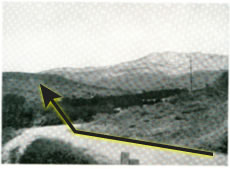
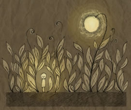
In a painting of the same scene (below-right), Cézanne solved
the compositional problems evident in the photograph. The distant hills have
been expanded in size, while the slope of the
hillside masonry is more gradual.
If
your design layout feels empty, first check the outside dimensions.
Cropping off the empty canvas area might be the solution. If you continue to
have doubts, adjust the placement of the subject matter.
The goal is to arrange the shapes until the composition feels complete.
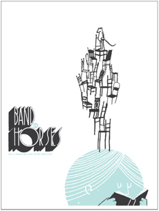
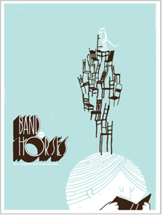
Compare the Band of Horses posters below, by Sasha Barr. In the version on the left, the white negative area of the page seems rather empty. This problem was resolved by reversing the colors and using a blue background in the final design (below-right).
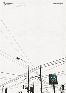
Mark Brooks' Communiqué poster contains a lot of empty white space. However, unlike the first draft of the Band of Horses poster, there isn't a feeling of emptiness. The power lines expand out diagonally to fill the page, creating a sense of expansion. No color is needed.
Crowded Space
Another compositional concern is crowded space. This occurs when too many elements fill the canvas. How do you know which to eliminate?
Mask different areas of the page until the design comes into balance.
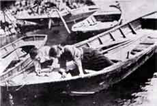
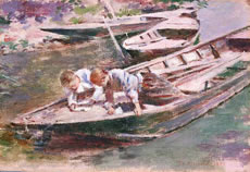
The photo below feels claustrophobic; there are too many boats in the harbor. The artist (Theodore Robinson) eliminated the left boat in the final painting. By
blocking out the three adjacent boats one-by-one, you might have arrived at the same composition!
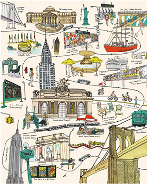
The Julia Rotham illustration below is very busy. However, it doesn't feel overly crowded. The space between each of the elements is carefully adjusted, allowing the energy to follow through the city streets.
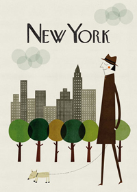
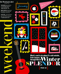
These magazine covers are packed to overflowing, but not crowded. The shapes are unified and evenly spaced. If just one more element were squeezed into either design, it might break the camel's back, but the spacing is harmonious as it stands.
Pictorial Depth
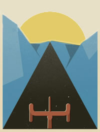
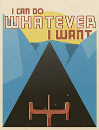
A poster is a flat surface, but it can create an illusion of depth. In the image below-left, the one-point perspective of the road leads back, back, back, to the setting sun. The sense of perspective creates depth, but once you arrive at the vanishing point, you're stuck. The viewer drifts off that cliff and doesn't come back.
In the final poster on the right, the large "I can do whatever I want" title holds the viewer in the picture. After reading the title, the eye circles back to the bicycle in the foreground.
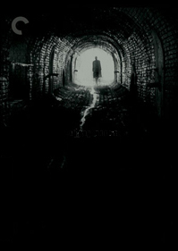
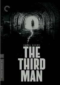
The same effect works in reverse. In the image on the left, the viewer is drawn irreversibly into the tunnel. Stuck. In the final design on the right, the tunnel doesn't feel as far off. The tension between the tunnel and the movie title engages the eye.
Cézanne carefully controlled the pictorial depth in his paintings. In a photograph of his motif The Sainte Victoire from Beaurecueil, the road leads back to the distant mountains. Lovely scene, but it only has one direction, pulling back into distant space.
The forms in Cézanne's version of the landscape are more visually engaging. The road no longer leads far into the
distance. The mountains in the background expand up and to the left, while the road in the foreground pulls down and forward. The eye moves between the two trees, between the two houses, and between the three triangular hillsides.
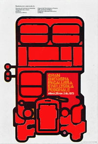
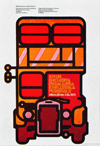
Deep fathoms of space should be avoided, but you don't want your design to be too flat either. In the modified Mimmo Castellano illustration (below-left), the red bus is as flat as a pancake. In the final illustration on the right, the variations in color and texture give the bus dimension and form.
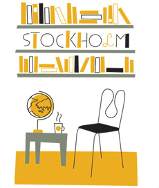
At first glance, these illustrations by Olimpia Zag may seem flat. However, they contain a good amount of depth. The black books on the Stockholm shelf appear to shift slightly forward. The gray table is flat against the wall, but the yellow floor expands forward and the chair is drawn three-dimensionally.
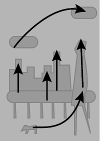
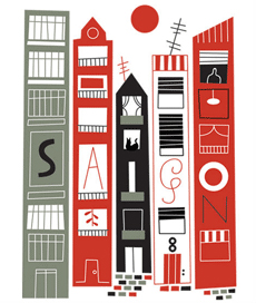
Each of the buildings in the Saigon poster is on a a different plane. The brick pattern leading up the buildings pushes them back in space.
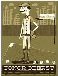
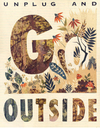
The illustrations below use flat shapes, but there is a sense of pictorial depth. Some shapes are in front, some shapes are in back. The eye is engaged in the process of moving from plane to plane. It feels satisfying because all the shifts occur within a controlled range—nothing is too far back or too far forward. The Conor Oberst poster was designed by Kansas City-based Vahalla Studios, and the Go Outside poster is by illustrator Hollie Chastain.
Using three-dimensional shapes is a sure-fire way to create depth. In the posters below (left by Keating & Keating, right by Les Mason), the subject matter is incorporated into the surface of the canvas while maintaining a sense of form.
Cézanne declared "I advance all of my canvas at the same time." From the first sketch to the final painting, the entire picture was considered. If there were merely a few lines on page, they were placed in relation to each other and the four edges of the canvas. The painting was a complete unit at each stage of the development.
Approach your design projects in the same way. Start with a small, simple black and white sketch, establishing the negative
space right from the beginning. Stop when you've spaced the subject
matter over the entire area.
Step back and look. Keep testing, weighing,
and blocking out your design as it develops.
Avoid too much detail on your first draft. Stay focused on what is happening
to the picture as a whole. Don't add color or illustrative details until you're sure of the basic forms of the composition.
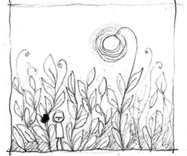
Artist Yeesan Loh built up a strong structure before adding color to the final illustration below.
In the exercise that follows, you'll experiment with all three kinds
of negative space: open, closed, and divided.

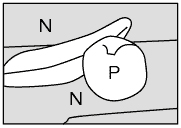
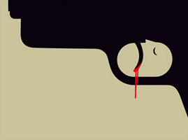
 Reversing the positive and negative areas may cause your viewer to do a double-take.
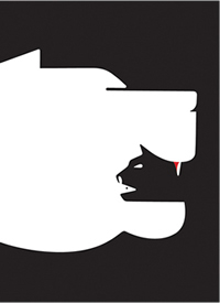
 Type designers are very sensitive to the relationships between positive and negative shapes.