RGB Color for Screen
In Lecture One, we identified the three primary colors as red, yellow, and blue. These three colors are the foundation of an artist's palette.
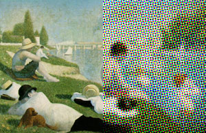
A computer uses a different set of primaries—red, blue, and green—RGB. Yes, that's right, yellow has been eliminated and replaced with green.
It might comes as a surprise to learn that there is no yellow in a television tube or computer monitor. What we see as yellow is actually a mixture of tiny dots of green and red.
Step back and look at these red and green dots from a distance. Strangely
enough, they blend into yellow.
There are fundamental differences between CMYK and RGB color systems. The colors are mixed in two different ways: additive and subtractive. First, let's explore the color on your computer:
Note
RGB values are measured on a scale of 0 to 255. The lower the number for each value, the darker the hue.
Additive Mixture
RGB is an additive system, which means that when you add the three colors together, you get white. When none of the colors are present, you get black (or the absence of light).
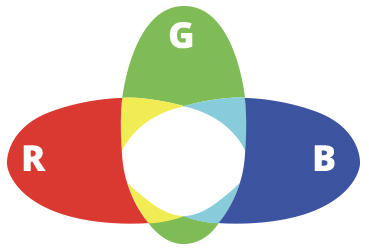
On your computer, red, green, and blue combine to create white.
If you want a lighter version of any color, add equal proportions of red,
green, and blue to raise the value.
To lower the value, decrease the amount of red, green, and blue
by the same amount. This is the basic principle of mixing additive light.
If this reminds you of the color picker in your software program, you're entirely right! Computer imaging uses the RGB system (red, green, and blue) in which these colors are combined to increase or decrease the value of the colors that appear on your computer screen.
Subtractive Mixture
Paint colors and printing inks operate by the rules of subtraction.
When you mix ink or paint, the color becomes less pure. That's why digital photos always look duller when you print them out than they do on screen.
If the three colors of the primary triad (red, yellow, and blue) are mixed together, the result is less color: in theory, black.
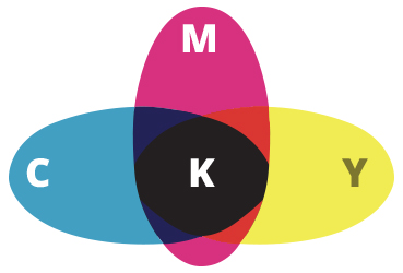
In print, cyan, magenta, and yellow combine to create black.

When you work in CMYK mode, Photoshop dulls the display of colors to stimulate what the colors will look like printed out.
You may be wondering why there is a K (black) in the mix when cyan, magenta, and yellow can be combined to create black. To print black with C, M, and Y, you'd need 100% of each one, and that's a lot of ink. Too much ink in a printing press can make a mess of things. Adding black ink is more efficient.
Back to Top
Color, Web Design, and Psychology
In print design, color comes at a price. Depending on the budget for a project, you will have to decide whether to print in full CMYK, grayscale, or just a spot color. Many of the print design examples we looked at in Lectures One and Two used only two colors to produce, partly because of the color scheme chosen and partly to save money.
Create web graphics in RGB mode.
Color is free on the web, so it can be tempting to go overboard. However, it is important to stick to a color palette when building a web site. Using too wide a range of hues will look garish and unprofessional. You'll notice that most sophisticated web sites are designed with just one or two colors. That may sound strict, but actually, you'll have still have a full range of values and intensities to work with.
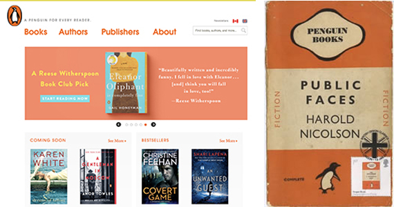
The Penguin Books web site employs a orange and blue color scheme. This unifies the overall design while reinforcing the orange Penguin logo. As you can see, there is still plenty of variety—a bright-orange, a pale-blue, a darker, gray-blue—plus white and gray.
The color selection of Penguin Book's web site is a natural extension of its print identity. Loyal readers are reassured to find a familiar look and feel.
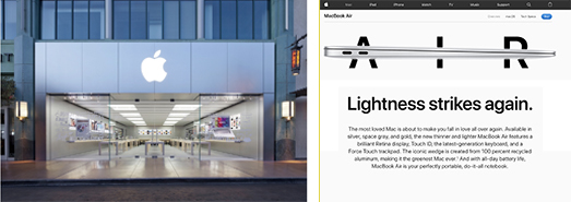
When deciding on a web color palette, the first place to look is the company's existing brand. Apple stores are clean, sparse and minimal, as is the Apple web site.
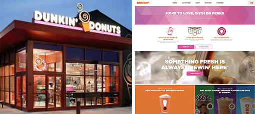
Dunkin' Donuts shops are are pink and orange in the real world, and pink and orange in the virtual world.
If your client doesn't have an established brand, then you'll have more freedom to select a color scheme. However, pay attention to the meanings of the colors you choose.
Color Psychology
Depending on your choice of color, your designs will create distinct impressions on your target audience. Here, we'll look at the psychological effects colors can have on web site designs; concepts that translate to print design as well. Note that these color suggestions are based on Western culture; other cultures may have different associations with color.
Note
Color psychology is the study of how color affects our moods, feelings, and behaviors.
WHITE
Purity
Innocence
Fresh beginnings
Spirituality
Cleanliness
White suggests happiness in the home. The color white aids mental clarity. Doctors and nurses wear white, and most health care industry web sites have white backgrounds.
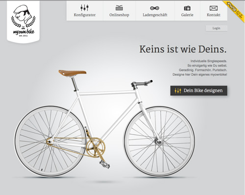
This pure white design exemplifies perfection in form and function.
Credit: http://www.myownbike.de/
BLACK
Elegance
Sophistication
Mystery
Authority
Power
Strength
Black conveys elegance and sophistication. Dark color schemes have a formal, serious feeling.

This design exudes power and authority.
Credit: http://www.nitewatches.co.uk
Consider how your branding color is perceived in different cultures. In China, red has positive connotations, symbolizing fortune and happiness. In parts of Africa, however, red is a color of mourning.
RED
Passion
Heat
Power
Excitement
Danger
Red serves two purposes here: association with Asian culture and appetite stimulation.
Credit: http://greenonion.in/
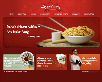
Red serves two purposes here: association with Asian culture and appetite stimulation.
Credit: http://greenonion.in/
BLUE
Tranquility
Peace
Reliability
Solitude
Melancholy
Blue is calming and enhances concentration. Blue symbolizes loyalty and inspires trust.
Credit: http://greenonion.in/
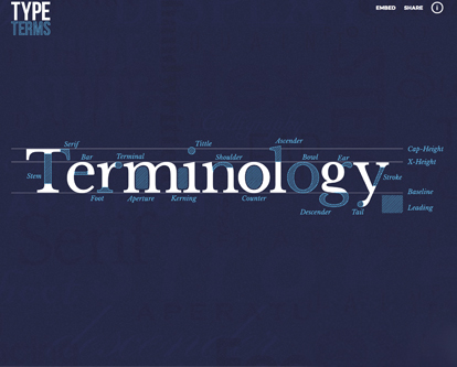
Learning typography in blue. A tranquil look.
Credit: https://www.supremo.co.uk/typeterms/
GREEN
Life
Youth
Hope
Growth
Affluence
Jealousy
Green calms without being overly sedating. It's refreshing, and of course, green means go!
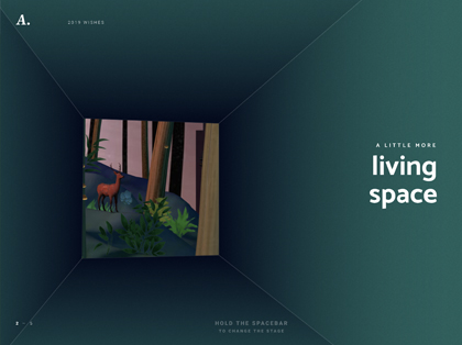
Green is calming and inspires hope amid disaster.
Credit: https://2019.lesanimals.digital/en
Note
How we perceive color greatly depends on value and intensity. Dark, olive greens invoke nature, whereas bright, pure greens are more energetic.
YELLOW
Happiness
Playfulness
Creativity
Optimism
Yellow is bright and energetic, but in large quantities, it can be eye-fatiguing and irritating. Yellow can even make people lose their tempers.

This site uses the playful and creative side of yellow.
Credit: https://www.melyssagriffin.com/
PURPLE
Luxury
Wealth
Royalty
Eccentricity
Purple has rich undertones. It is associated with deep feeling.

Rich and luxurious is the feel of this purple site.
Credit: https://www.rekupe.com/
BROWN
Authenticity
Substance
As UPS might say, what can brown do for you? It grounds the design in substance and authority.
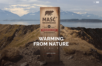
This brown-based site feels like an informational authority on the subject.
Credit: https://www.mascniedzwiedzia.pl/en/
Choose a hue for its psychological association, then use value and intensity to fine-tune the mood.
ORANGE
Warmth
Contentment
Vitality
Orange packaging indicates affordability. Orange creates energy and movement, without the aggressive energy of red.
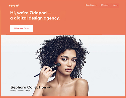
This orange design is so full of life.
Credit: https://www.odopod.com/
PINK
Romance
Femininity
Youth
Pink, especially in its softer tints,
is soothing. It calms. "Hot" pinks can stimulate activity.

Informative, active, and a little playful.
Credit: http://subplot.com/newsfeed/
Check out the following video tutorial for a more in-depth look at the ways color is read in Western culture.
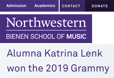
Case Study: Single Color, Gray Background
Purple is a bold color with a lot of personality. In large quantities it might come on too strong, but as an accent it is refreshingly eccentric, especially when contrasted with an understated gray background.
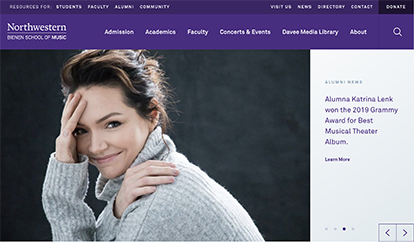
Credit: https://www.music.northwestern.edu/
Sample from the base colors to create lighter or darker variations of a hue.
Gray backgrounds are a nice alternative to white. The pale-gray creates less screen glare than a pure white, creating a subdued, quiet feel.
BACKGROUND COLORS
PALE GREY
Shades of purple are used as accent colors. No additional hues are necessary.
PUNCH COLORS
DARK PURPLE
PURPLE
The menu links are white on purple while the paragraph font color is the same purple on grey.
Whether by coincidence, or not, the textured grey on Katrinas' sweater matches the grey on the right sidebar.
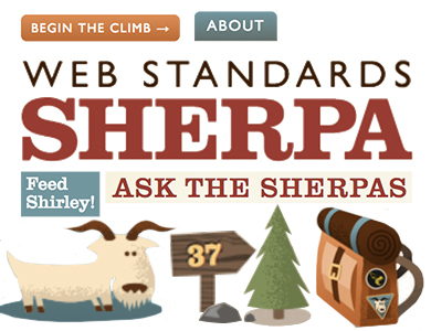
Case Study: Two Colors, Brown Background
Brown is another option to consider when choosing a neutral background color. Brown has a warmer, earthier feeling than gray.
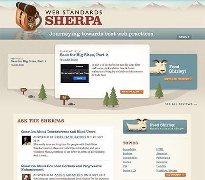
Credit: https://webstandardssherpa.com/
The Web Standards Sherpa web site uses a light brown body background with a teal accents. The white content area provides contrast, keeping it clean and bright.
BACKGROUND COLOR
WHITE
BROWN
TEAL
Dark red is chosen as a punch color. Pure red would have stuck out too much, but the dark red sinks nicely into the brown. The light blue-green accent color is the same hue as the dark blue-green header.
PUNCH COLORS
DARK RED
ORANGE
Note
A vibrant punch color can change the mood of an otherwise low-key print or site design.
The typography displays a variety of font colors and styles while maintaining a unified look and feel. The illustrations make the site fun and lively.
The background textures reinforce the theme of Sherpa. Pure, solid color would look too modern—texture has a more personal quality.
Case Study: Multi-Color, Dark Background
Dark background colors give the Artem Pivovarov site a sophisticated appeal. The bright accent color and grungy headline keep the design fun, otherwise it might seem too somber or even depressing.
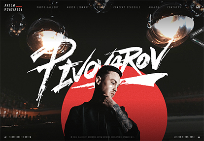
Credit: https://artempivovarov.com/
If you look closely at the background, you'll notice that various shades of black are used. The big red solid circle separates the artist from the background, that is a pure black with stage lights and moving disco balls above.
BACKGROUND COLORS
DARK GREY
BLACK
Mousing over the top navigation bar reveals animated underscores that highlight each menu item in a bright, candy-apple red, the same red as the solid circle.
Consider font colors, background colors, punch colors, and textures in any type of design project, not just web sites.
With the exception of the stressed and splattered headline, the other font used shows consistency with its elongated sans serif look. The pale grey color of the menu items text are set off from the white fonts.
Case Study: Two-Color Design
Dark greys are a good choice for corporate web sites. The contrasting mint green punch color adds a bit of "flair" to this design.

Credit: https://www.andoverforktruckservices.co.uk/
The light grey background colors are easy on the eyes. The white headline divides up the page, keeping it from being too dark.
BACKGROUND COLORS
LIGHT GREY
DARK GREY
PALE MINT GREEN
Yellow has excellent contrast against the blue background. It is used carefully, only as needed, in small quantities.
Combine pastels with neutrals to keep a design from looking too feminine.
The white type color contrasts the busy grey background. Note that the corporate logo is the same dark gray as in the design.
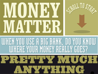
Case Study: Pastels
Pale, pastel color schemes are a refreshing change from the vibrant color seen all over the web.

Credit: http://makeyourmoneymatter.org
A range of pale greens give this design a cool, refined style.
BACKGROUND COLORS
PALE GREEN
PALE GRAY-GREEN
PALE BEIGE
The punch colors have minimal contrast, just a shade deeper than the background. Normally, you would need more contrast to catch the viewer's attention, but the subtlety of the color scheme creates intrigue.
PUNCH COLORS
SOFT BLUE
BROWN
The low-contrast typography would be tiring to read in large amounts, but the text is carefully edited into short paragraphs.
Vector textures modulate the background colors beautifully.
Now let's look more closely at guidelines for combining color and type, whether on the web or in print design projects.
Back to Top
Color and Type
In the words of the great designer Paul Rand...
Sorry, what was that?
Better, but,
Look at your type in grayscale mode. Sufficient value contrast is essential for legibility.
There you go. Value contrast is of vital importance in typesetting. As you can see below, yellow, red, and blue each have different values:

Yellow is a light color with good contrast against black.

Red is a medium value color. It has minimal value contrast against black. However, the red text is legible because the intensity of the red gives it some lift.

Blue is a dark color and hard to see on black. Almost no value contrast at all.
As a general rule of thumb, place light font colors against dark background colors, or dark font colors against light background colors.
White type is impossible to see on yellow.
You either have to make the background darker...
...Or the type darker.
Black type doesn't have enough value contrast against a dark-violet background.
The dark type reads better against a lighter violet.
To improve legibility in this example...
...I made the type darker and the background lighter.
Contrasting Intensity
If value contrast is King, then intensity contrast is Queen. Place bright font colors against neutral backgrounds, or neutral font colors against bright backgrounds.
Avoid combinations of pure, bright colors:
Bright blue text appears to vibrate against a bright orange background.
A darker blue text color feels more solid.
Red and green have strong color contrast, but low value contrast. This makes the text hard to read.
Using a darker green helps, but the value contrast is still low. You would need to increase the font-size to make this legible.
Note
As with other design elements, adjacent complementary colors of the same value and intensity appear to vibrate.
Contrast pure, intense font colors with dull, neutral background colors:
Too bright...
Better.
Or even better, shift the red to orange.
Two brights cancel each other out.
The bright orange text contrasts with the dark green background.
Contrasting Hue
One more factor to consider: hue. A monochromatic color scheme uses different tones of the same color.
Pale green text is legible against a medium green background, but the effect is very soft. There is no contrast in hue.
Monochromatic color combinations are attractive for short text call-outs or headings, but tiring to read in long sections of text.
Analogous colors create a similar effect:
Yellow text blends smoothly with the orange background.
This combination would be fine for a page title in a large font-size, but not for long paragraphs in a smaller font-size.
For more impact, contrast cool tones and warm tones:
Rather than pairing a cool blue with a cool purple...
..use a warm yellow. Notice how the warm tone lifts the type?
Selecting the right color choices for typography can be a challenge. Check out this review kit for a closer look at these concepts.
Type, Color, and Emphasis
Designers use contrast of value, intensity, and hue to emphasize or de-emphasize a particular word or phrase.
In the left-hand book cover, the white Otto catches the eye. Tomi Ungerer is much softer. The violet letters sink into the blue background. In the right-hand design below, Tanaka Ikko stands out more than Graphic Master. In both cases, the most important text comes forward first.
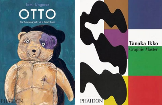
Different levels of contrast make some words (such as Otto and Tanaka Ikko) read first, while others (such as Tomi Ungerer) recede.
It is important to start with a clear intention. What is important? What should readers see first?
Value contrast can have a stronger effect than pure hue. Take a quick look at the book cover below (left). What stands out more, Masters of cinema or Alfred Hitchcock? What do you think was intended? The visual hierarchy in the design to the right is clear—four layers of values—as the type grows smaller, the value contrast fades.
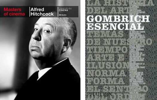
Value contrast between the title and author creates a hierarchy on the left; scale contrast creates visual hierarchy on the right.
In the Frankenstein book cover below, the author byline is more prominent than the book title. Perhaps the designer intended it this way. The strangeness of the photo gets you to look twice; Frankenstein is unraveled as you bend your mind around the photo.
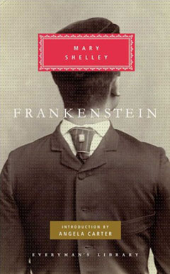
A surreal image draws the eye into the design.
The degree of contrast also depends on the style of the book. Is the design concept clean, modern, and stylish? Go for maximum contrast, as in the cover below.

The stark contrast clearly directs the eye through this modern design.
Below, the contrast is much softer, creating a comfortable, inviting quality. You are drawn in by the pattern of colors (left), then you read the title. Subtlety can be powerful (right). The sense of mystery is captivating.
Subtlety, pale colors, and low contrast create calming and alluring designs.
The title on the cover below is pure contrast. It's clean and direct with no ambiguity whatsoever. It's not meant to be mysterious; it's a cookbook.
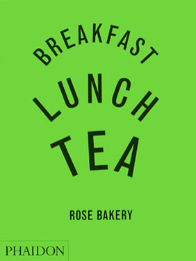
This cookbook cover is vibrant and clear, with strong visual contrast.
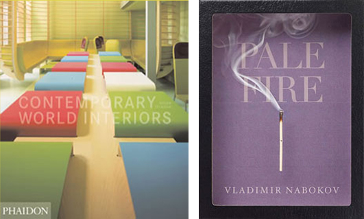
It is important to consider the overall plasticity when setting the contrast of typographical elements. Look at the book cover below (left) and imagine The Silver Spoon Pasta in black type rather than gray. Black type would pop off the page too strongly. The gray adds a softness, keeping the title back in space, on the same level as the pasta.
In the book cover design for Paella (below, right), the overlapping black tab holds the red circle back in space. Paella expands forward slightly, but it feels contained by the circle. On another level, the red checked border pins the black tab to the edge of the page. Forward-back-forward-back. And yet, it looks so simple.
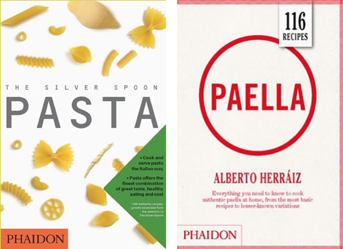
A consistent color palette grounds the design on the left, while a clear contrast creates tension in its simplicity on the right.
Contrasting Type and Background Colors
The background color is an important factor when choosing font colors. Place light type on a dark background (below, left) or dark type on a light background (below, right).
Light on dark, or dark on light; these color combinations are aesthetically pleasing, as well as legible.
When the background color varies (below, left), you have to choose a color that will read well across the board. And when the background color is very strong (below, right), you need an extra element to help the information break away from it. In the Silver Spoon for Children book cover, the designer gave the cream-colored lettering a dark drop shadow for extra emphasis.
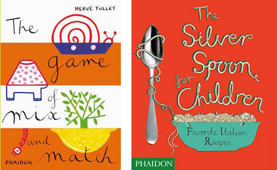
The title on the left is still legible, despite variable background colors and a mid-value background. The title on the right needed a dark shadow to help it read well off of a vibrant background.
Red is a tricky background color since it is a mid-value. To make an impression, you need very dark type, or very light type. The white type is legible on the cover below, but it is subtle. The designer is relying on the brick background to communicate "House" as much as the type itself. The bricks make the first impression, then you read the title.
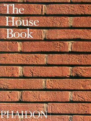
Do you read the word "House," or do you see the bricks and the title simultaneously?
Be careful when placing type atop a photo. Use color or value to ensure legibility.
Type can be hard to read on top of photo backgrounds. The variations of color in a photo run from light values to dark values, making it difficult to choose a font color with enough contrast.
In the book cover below (left), the designer relied on contrast of hue, keeping the background photo in black and white and choosing a beautiful blue for the title. It doesn't have much value contrast but it still works. Of course, the large font-size also helps.
Low contrast text can be compensated for with scale and eye-catching placement.
In the cover above (right), the white title is placed over the darkest area of the photo. The legibility isn't 100%, but the photo and the title are so simple and straight-forward that it is easily understood.
The title is small on this cover, but it has excellent value contrast:
A clear image and high contrast between the text and background make this cover legible and interesting.
Another approach is to vary the font color over different parts of the photo: dark type on the light area of the photo, white type on the dark area:
A clear image and high contrast between the text and background make this cover legible and interesting.
If the book title itself is of equal or more importance compared to the photo, it might be a good idea to arrange the composition to allow a solid background color behind the type.
In the example to the left below, notice how the designer used overlapping brown rectangles to visually connect the type area to the photo area. The black Shigeru Ban title perfectly balances the dark green bush in the photo.

Visual elements knit the background and text together, in one cohesive composition.
On the right above is another a creative solution. The white background defines the text area while allowing the background texture to show through as the type color.
Unifying Font and Background Colors
In the examples above, the designers pushed for contrast between the font color and the background color to enhance readability. You need contrast for type to be legible—that's indisputable. However, it is also important to maintain a sense of unity between the image and the type.
The book cover on the right beautifully combines the type and illustration into a single, strong graphic.
In this Pork & Sons cover (below, left), the bright, intense magenta title catches the eye. A softer magenta is repeated in the gingham background pattern. Pulling the font colors from the artwork is a sure-fire way to create unity, as shown in the middle example below, and treating the type as part of the illustration itself—not just words on a page—also creates a great effect (below, right).
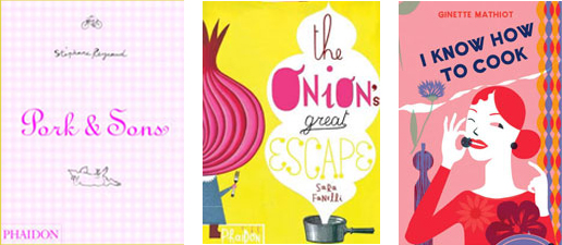
These three book titles pull colors and treatments directly from the designs to create cohesive book covers.
Below, color is used to move the eye between the orange STORIES subtitle and the orange hospital bed. The page title is melded into the photo, with the T resting its head on the pillow.
Use color to control whether type shouts or whispers on the page.
Back to Top
Font Colors and Psychology
Most often, designers start with an image, then font colors are chosen to complement the image.
However, interesting results occur when you first the consider the significance of the title and how to express words with color. What does "despair" say to you? Black, certainly. Isolating the title on a black background, far from the rainbow border, feels even more poignant (below, left). Alex Lemon's Happy tells the story of a star college athlete who suffers a hemorrhagic stroke. Both sides of the story are illustrated in the smiley-face yellow and the dripping pink type (below, middle). Consider a sensation that you want the color to project, then push it to the boiling point (below, right).
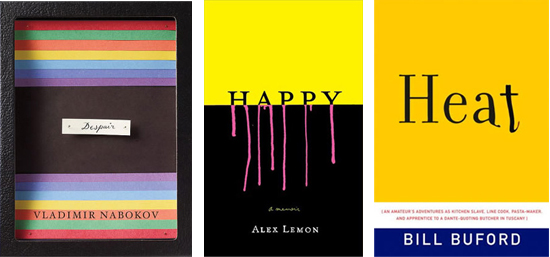
So much can be conveyed by using only text and color.
The right color can imply the personality of the subject of a book. Intelligent gray and warm orange for Barbara Walters (below, left), or bright, trendy hues for a fashion addict (below, right).
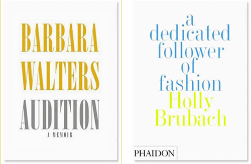
Similar, yet different. These book covers use only text and an abundance of white space, but the color choices suggest very different personalities!
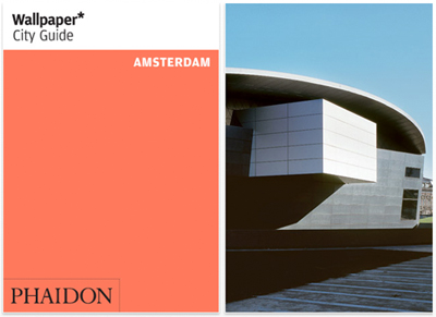
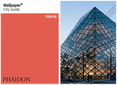
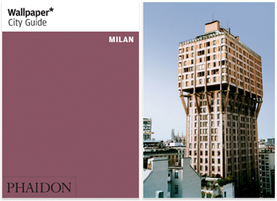
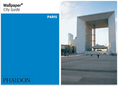
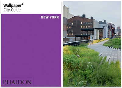
Do cities have color personalities? This tulip orange seems very expressive of Amsterdam:
A stronger red orange for Tokyo:
A muted plum for Milan:
Parisian blue:
And vibrant, eccentric violet for New York:
Alternating Font Colors
A contrasting font color will focus the reader on a particular phrase. Guess the title of the book below:
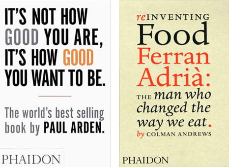
Variation in color can express the intonation of the text, making the reader pause and consider a particular word, like "good" in the cover on the left below. Alternating font colors creates a visual pattern in the cover on the right, engaging the viewer in the game: red-black-black-red-red-black-black-black-red-red-black. And black.
Using colors to emphasize specific words, phrases, even punctuation, can change the way a title or phrase is read.
Color applied to type can be purely decorative. This Max Huber cover (right) is a beautiful example of push and pull. The orange letters expand forward, the blue letters shift back, and the overlapping edges lock you in.
Alternations of color hold the viewer's interest. Perspective-Global Context, shown below, starts with black on gray, adds green as an accent, reverses the colors to white on green, switches to gray on white, and surprises with white reversed out of blue. The alternation in color makes it interesting, while the repetition of font size and font style maintains a consistent look and feel.
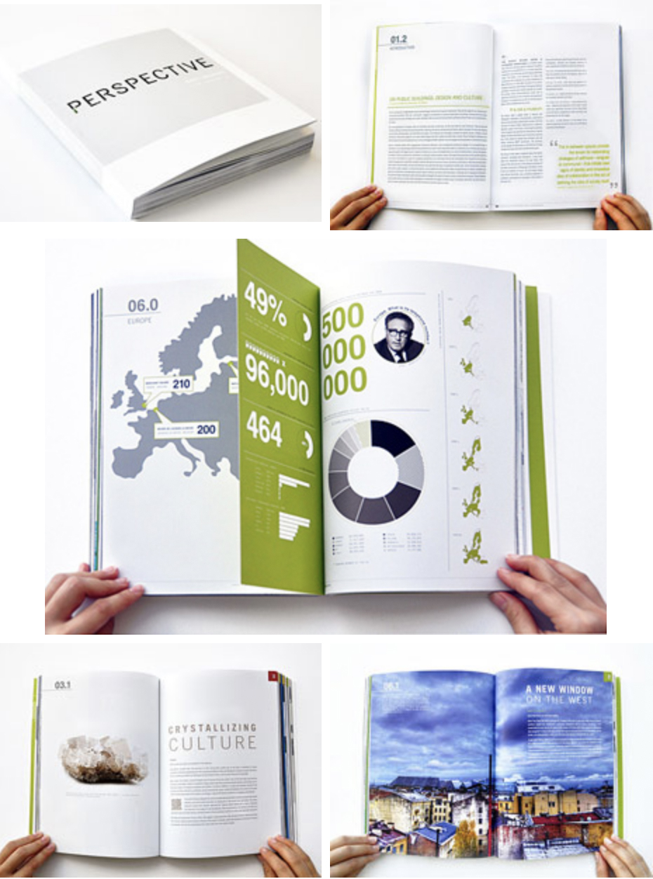
Gray and green alternate with spikes of blue to create an alluring and very consistent design.
Color continuity, or the way colors repeat and/or vary in a series, is important to consider in any multi-page document on the web or in print. Let's take a look at how a designer achieved continuity of color in this magazine layout.
In the exercise that follows, you'll use your imaging tools (and what you know about color) to create a book cover of your own. So, to paraphrase Superman, onward and upward!