Can you believe your eyes? Most of time you can, but there are a few colorful
exceptions. Some of the most interesting effects of color interaction are best observed in pure form.
Let's start by looking at how value affects our perception of color.
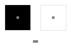
Study the small gray squares in the center of each diagram below. The small gray square on the black background appears lighter, and slightly larger, than the small gray square on the white background.
In reality, both small squares are the same value and the same size. You can see this when the two small gray squares placed adjacent to one another, just below the diagram.
Surrounding the gray square with black causes it to appear lighter (and bigger) than it actually is. Surrounded with white, the square appears darker (and smaller) than it actually is. It's magic!
As strange as it sounds, value contrast can make an object appear bigger or smaller.
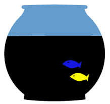
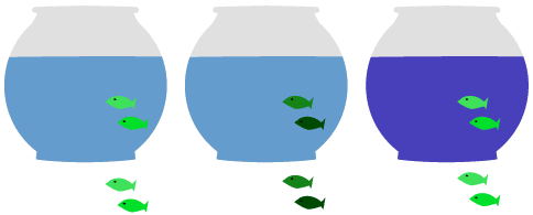
In the first bowl, you can barely see the fish. To correct this, I made the fish a darker green in the middle bowl. This worked, but the fish appear small and dull.
So I tried a different approach. Rather than changing the color of the fish,
I changed the color of the water. The dark blue water (bowl on the right) makes the fish look big and bright.
As they say in art school, "If you don't like a color, change the color next to it."
When you place two complementary colors together, their brightness is intensified.
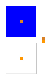
Study the diagram below. Which orange square is the brightest? The orange square on the blue background is the clear winner, right?
Actually, both squares are at full saturation, as you can see by looking at the two small adjacent orange squares to the right.
However, because of the contrast of complementary colors, the upper orange square appears to be brighter than it really is.
Now turn your attention to this example. Do the orange squares look the same to you?
The orange squares may look like the same shade of orange, but they're not.
The orange square on the blue background has been dulled slightly. However, its complementary blue background gives it a little extra kick, so it looks just as bright as the pure orange square within the white square.
In this final example, we experiment with two dull orange squares and place them in the same situation.
Now the swatch with the large blue square appears to be at full intensity, while the orange swatch below shows the true dullness.
In large quantities, full-saturation complementary colors can make quite an impact. Unless your theme song is "Dance the Dance Electric," mute complementary colors for a less psychedelic effect.
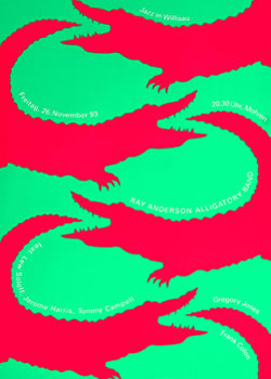
Look steadily at the crocodiles in the poster below. At full intensity, adjacent complementary colors will appear to vibrate.
Choosing muted, more neutral variations of red and green is much easier on the eye. Of course, it depends on the effect you want to make. The poster below uses similar hues as the crocodiles poster above, but the difference in intensity results in an entirely different mood.
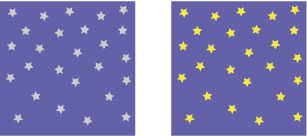
Compare the squares below. Which square is a richer violet?
Both squares have exactly the same violet background. However, the yellow stars complement the violet background on the right, making it appear richer and more saturated.
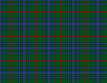
You can see this same principle at work in Scottish tartans. The plaid pattern on the right is based on analogous green and blue tones. Weaving in strands of red puts the color in the kilt.
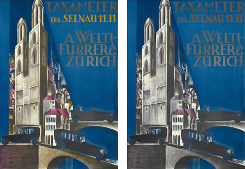
Adding just a small touch of a complementary color can stimulate a large area
of color. Compare the cityscapes below. On the left, you'll see the original poster by Otto Morach. On the right, I've used Photoshop to replace the orange highlights with grays. The lights have literally gone out, turning the city into a gloomy, dreary place.
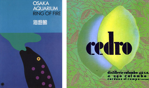
In the poster on the left below, Ikko Tanaka used an analogous color scheme. The blue, green, and violet are quite nice, but the small yellow eye steals the show. It gives the whole page snap.
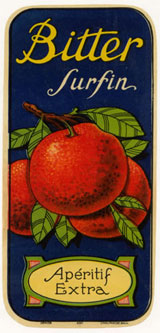
Cézanne used these effects in his paintings. He found that a lemon looks brighter with a blue outline and a red apple appears more brilliant if you paint green around it.
Back to Top
Interactivity: Neutrals
Now let's take a middle-gray swatch and see what happens when we surround
it with fields of color.
Take a few moments to look at the examples below, then read on.

The
appearance of a neutral color will vary depending on the colors
that surround it.
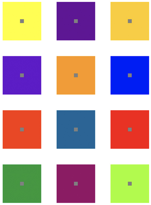
First, look at the gray square on the yellow square. Would you say that it is a violet-gray tone? How about the gray square to the right? Doesn't it have a bit of a yellow tone?
The appearance of each small gray square approaches the complementary hue of the color field it's placed in.
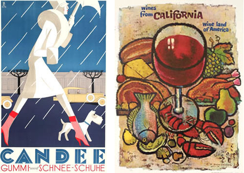
This leads me to wonder, does the blue sky in the Candee poster (below, left) give the gray building a yellow tone? Neutral colors are rarely flat, lifeless fields of gray or brown. Subtle flashes of color in the neutral background of the California wines poster (below, right) intrigue the eye.

The shots of color in these two posters keep them interesting and lively, instead of dull and predictable.
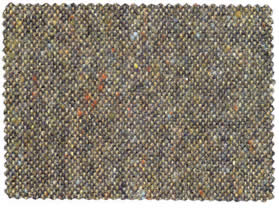
This theory is put to good use in fabric design. This gray tweed might be dull, but the tiny specks of color give it a soft glow.
Light
Light is another factor that affects our perception of color. For example, the
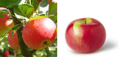
color of an apple will vary quite a lot depending on the light source. When the light comes from the sunny, blue sky, the lightest spot on the red apple is a pale blue (below, left). When the light source is a fluorescent lamp, the highlight is more of a pale yellow (below, right).
Note
The colors we see are light waves reflected off the surface of an object.
A red apple absorbs green, blue, and violet wavelengths and reflects red wavelengths.
The shadows also require careful observance. On round surfaces, the darkest shadow is not at the very edge, but slightly away from it, leaving a reflected light. If you draw the shadow up to the edge, the object will appear to be flat rather than curved. Look carefully at the highlights and shadows that make the oranges in this example appear round:
Careful consideration of light and shadow can lead to exquisite results.

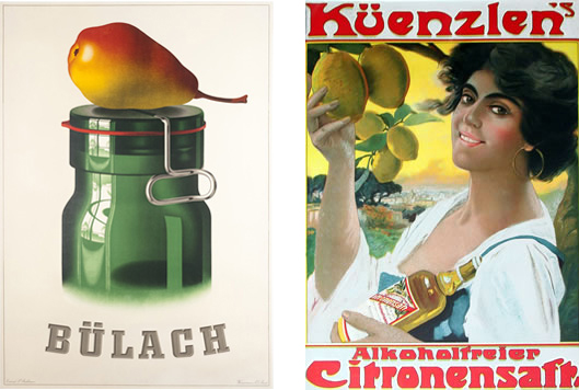
The Bulach poster (left) is a study in attention to light and shadow. Each lemon in the poster on the right is a different shade of yellow. The variations in color, size, and shape make the lemons interesting to look at. The shading also makes the lemons appear more realistic and life-like.
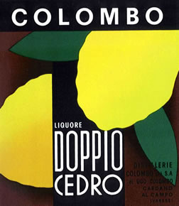
The Colombo graphic below is highly abstracted, but the artist still shaded the lemon on the left. The beauty is in the details:
Color and light analysis can be used to create stylized illustrations. To review this process check out the following video tutorial.
Back to Top
Color Plasticity
A canvas is flat, or is it? Some colors expand forward, others drop back—and designers carefully control these interactions.
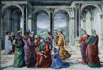
Renaissance artists relied on rules of perspective to create an illusion of depth and distance. In the Ghirlandaio painting below, the lines converge into a vanishing point off in the distant mountains. This is a very scientific approach, focused on creating a realistic depiction of the subject matter.

A vanishing point creates a linear perspective in this painting.
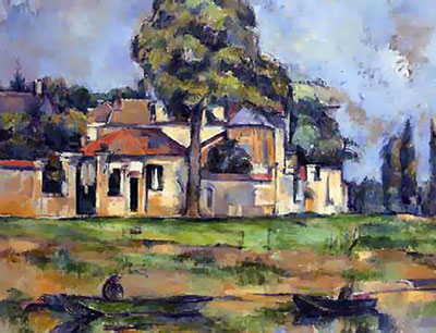
Paul Cézanne is known as the "father of modern art." He ignored traditional rules of perspective and flattened the picture plane. Cézanne introduced the concept of plasticity—a continuous back and forth shifting of planes.
Let's study a painting by Cézanne to see how this works. Visualize the planes of space in the landscape below. Which elements are the closest? Which are the farthest away?

Without a vanishing point or linear perspective, the darker elements appear to fade in the background, creating an abstracted landscape.
At first glance, this looks like a traditional landscape. However, upon closer investigation, we realize that the picture is abstracted.
The river and the boats in the foreground are painted with dark, neutral colors. This pushes them back in space. In contrast, the red and white house along the horizon expands forward. The pictorial depth has been flattened. In actuality, the house should be about a hundred yards back from the boats, but in the painting, the house is closer than the boats.
The opposing planes of the house and the river push and pull against each other. The depth of field is limited; there isn't much room to move forward or back. This creates a lot of visual tension, holding the viewer's attention. It's fascinating.
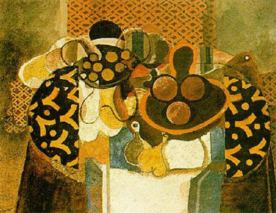
George Braque and Pablo Picasso expanded on the concept of plasticity in their Cubist work. In the Braque still life below, the table has been flattened. The pictorial depth is very narrow; all the planes are compressed within a few inches of space.

In this Braque painting, what objects come to the forefront? What recede to the background?
Note
Plasticity is created in the tension between opposing planes.
Allow your eye to wander across the Braque canvas shown above. Which shapes are expanding forward? Which shapes push back?
These depth perceptions can be subjective, but here is how I see it:
- The orange design on the table expands forward.
- The pale green stripes push back.
- The white tablecloth pulls forward.
- The dark bowl on top of the white tablecloth pins it back.
- The orange oval plate expands forward.
- The black outlines around the fruit push the orange oval back.
You could go on and on, shifting from one plane to the next, continually around the canvas.
Notice how each orange is shaded differently, which places it on a different plane—the lightest orange is the closest, the darkest orange is the farthest away. Also, the black tablecloth is modulated with orange highlights. The left side of the table appears to be closer than the right side.
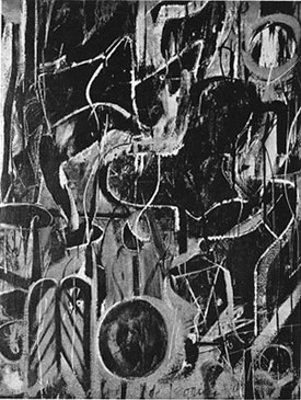
Willem de Kooning was an all-time master of plasticity. He carefully balanced the expanding and receding shapes across the canvas. Study this painting carefully. Which shapes are on top?

De Kooning's Light in August blends foreground and background planes with plasticity.
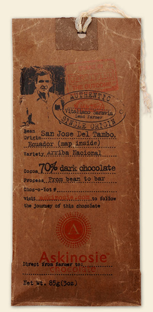
Graphic artists employ these same concepts of plasticity. Color is used to control which elements expand forward or shift back in a design. This chocolate packaging may look rustic, but there is a lot going on.
The shifts in space are very subtle, within a narrow depth of field:
- The oval Authentic Single Origin stamp pushes forward.
- The portrait also expands forward, from behind the stamp.
- 70% dark chocolate is forward.
- From bean to bar is back.
- The red Askinosie logo expands forward, but the brown background holds it back.
The eye moves back and forth, up and down. The opposing planes create tension, engaging the viewer in the design. Hungry yet?
Back to Top
Creating Plasticity
What makes a color expand forward or shift back? The key to creating color plasticity is contrast of value (light or dark), contrasting hue (warm or cool), and contrast of saturation (dull or bright).
Contrast of Value
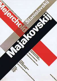
Take a look at this constructivist era poster to the right. What jumps out?
Majakovskij is clearly at the top of the stacking order. The white letters have strong value contrast against the black background, and value contrast makes things stand out.
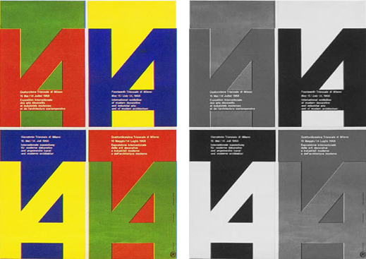
In the color version of the poster below (left), the blue 14 is expanding forward against the yellow background. And inversely, the yellow 14 expands forward against the blue background. Blue and yellow have strong value contrast, and strong value contrast will force an element forward in a design. The red 14 is much closer in space to its green background. Likewise, the green 14 is on the same plane as its red background. Red and green are about the same value. And zero value contrast makes a design flat. This is even more clear in grayscale mode (right).

In this poster, the color relationships create depth. Compare the full color version (left) to grayscale (right) to see the contrast clearly.

Pull an object forward with strong value contrast. Shift it back with less value contrast.
When viewing the grayscale version, the (formerly) red/green segments of the design are flat, whereas the (formerly) yellow/blue segments have a good amount of depth.
The rule of thumb is simple—if you want something to stand out, increase the value contrast. If you want something to shift back, lower the value contrast.
Contrast of Warm and Cool Colors

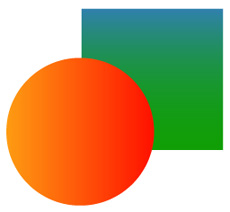
Though these are just basic shapes, they may leave you thinking of a warm sunny day or a cool dip in the ocean.
Color can feel warm or cool. Warm colors, like yellow, orange, and red, feel light. They have little weight, like sunshine. Warm colors expand forward, into the foreground of a design. Cool colors, like blues and greens, are darker and heavier. Cool colors shrink into the background of a design.
Note
Warm colors push; cool colors pull.
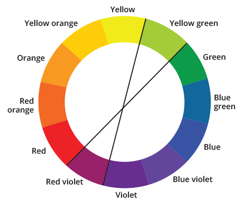
Looking at a color wheel, like the one below, you'll notice that the warm hues are on one side, and the cool hues are on the other. Yellow-green and red-violet, being in between, have both warm and cool properties. You might say that red-violet is a "warm" violet, or a "cool" red.
The tendency of colors to advance or recede is called push and pull. Warm colors push, cool colors pull.
You can use warm and cool colors to create an illusion of
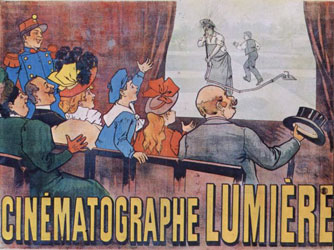
depth. The designer of the 1896 theatre poster below used bright, rich yellows and oranges in the foreground, and soft, bluish tones in the background. The effect is almost too much; the actors look like they are a mile away!
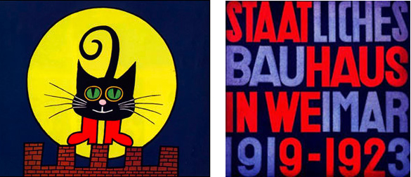
Placing a warm color against a cool background can really make it pop. In the children's book illustration (below, left), the bright yellow moon jumps off of the page, but the black cat keeps it pinned down. On another level, the cat's green eyes drop back, while the yellow rings around his eyes expand forward.
Alternate warm colors and cool colors to create interesting push-pull effects. The poster below (right) by Herbert Bayer has a lot of visual rhythm. The alternating warm and cool colors shift back and forth, creating pictorial depth.

Warm and cool colors alternate to create a vivid moon in a children's book illustration (left) or a pattern in this Herbert Bayer poster (right).

Colors are less bright in the distance and more bluish in tone.
Contrast of Saturation
Varying degrees of saturation
can also create an illusion of depth. Rich, saturated
colors appear to rise to the foreground, while desaturated, faded colors are pushed into the background.

Faded colors appear behind rich, saturated colors.
If you look at any landscape, you'll notice how colors become paler in the distance. This is how we perceive color in real life, and we can copy this effect to create an illusion of depth on a flat page.
The same effect works with warm hues. In the poster on the right below, the color red fades into a distant thunder.

The background of the poster on the left is muted, mimicking a human's perception of distant landscapes. The reds on the poster to the right recede as they fade.
Visual tension is created when dull, dark colors are placed on top of bright, richly saturated colors. The bright colors fight to push to the top, while the dull, dark colors hold them down. Plasticity is created in the tension between opposing planes.

Look at more of Herbert Bayer's work for classical examples of color use, typography, and composition.

The bright whites and greens pop to the top of this image, while the duller blues and reds ground the composition.
Plasticity: Adding It Up
Value, hue, and saturation are all factors in plasticity. When determining an element's position in pictorial space, consider which factor plays the strongest part.
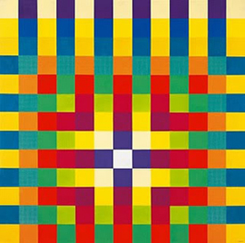
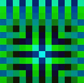
In the color pattern by Herbert Bayer (below), the blue squares in the top row expand forward more than the red squares in the bottom row. The red squares are a warmer hue, but the blue squares have greater value contrast.
In the second and third rows, the value contrast of the blue squares fades. The yellow squares gain more strength. By row four, the orange squares are expanding forward more than the blue. The value contrast of the blue squares and the orange squares is the same, so the warm orange hue wins.
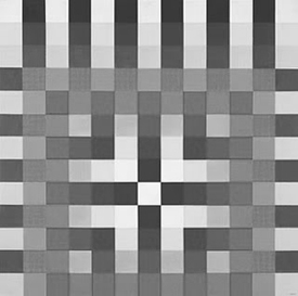
Looking at the same image in grayscale (below), the interaction of values is more clear. The (formerly) orange squares don't expand forward at all now. The cross in the center on the design is more prominent.
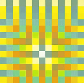
If the hues are adjusted, as they have been below, then the balance shifts. The yellows are the stars here, while the pale, dull greens shift to the background.
Upping the value contrast changes everything. The dark blues are on the top of the stacking order in this version:
Note
Controlling plasticity in design enables you to build a hierarchy of information for viewers.
Back to Top
Controlling Plasticity
With great power comes great responsibility! Now that you know how to create plasticity, you'll need to learn how to control it. You want your focal point to expand forward, but not so much that it pops off the canvas. Remember that Cézanne worked within a limited depth of field. The top and bottom planes in Cézanne's paintings shift back and forth within inches of space, not miles.
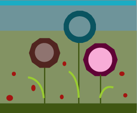
In the illustration below, the pink circle sticks out too much. It isn't connected to the rest of the canvas. The other colors are down on the lower levels of the stacking order, but the pink circle is way up in the stratosphere.

What doesn't fit? The pink circle stands out against the rest.
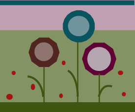
To fix it, you could decrease the intensity of the pink. The colors are about equal in saturation in the illustration below. There is a subtle shift from flower to flower, but it is more contained:

Bring the pink down, so it's closer to the other colors in the composition.
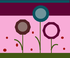
Or, take another tactic: Repeat the pink of the flower as a background color. This integrates the flower into the canvas.

There are many ways to integrate the colors of a design or illustration..
There are a million possible variations. When you change one color, you'll often have to change another color to balance it out. The trick is to step back and look, making adjustments until you get just enough push, just enough pull.
Overlapping Shapes
Imagine you are working in zero gravity. If a shape is floating off the page, you would want to pin it down.
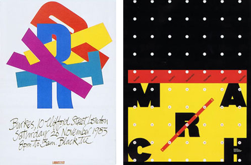
The typography in the poster below left is a tremendous jumble. The yellow A is fighting its way up to the top of the stacking order, while simultaneously holding back the red P. The blue R and cyan T have the yellow A pinned firmly in place. The violet Y floats calmly on top, with just the tip of the yellow A tying it to the stack.
Take a look at the Herb Lubalin calendar below right, then imagine it without the red diagonal line over the R. The free-floating R would pop off the canvas, right? The red diagonal line works as a weight, keeping the R at the same level as the other letters.
Note
Plasticity enables you to grab viewers' attention, hold it, and direct it.

In both compositions, the colors act as weights, keeping the pieces balanced and interesting.
Usually, background colors are in the background, and type sits on top, but in Lubalin's calendar, the yellow background hovers above the black letters. The effect is created by reversing the letters out of the border of the page. The white dots rise above the black background, but sink into the yellow background. Up, down, forward, back—the opposing energies create a lot of tension, but it is all unified in a coherent whole.
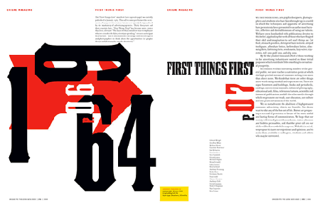
The Emigre magazine spread below also works with overlapping shapes. The red arrow is pushing out from below the heavy black numerals. In an interesting twist, the white 90 appears to merge with the bottom plane while simultaneously sitting on the top plane. The paradox holds the viewer's attention.

This Emigre spread uses color relationships to push a red arrow against heavy black numerals.
Merging the Background
Controlled areas of space are satisfying to the human eye. We like to know where the boundaries are; that's why paintings are framed. If an image sprawls out to infinity, the mind can't contain or process it.
Along with an image's height and width, designers also determine the amount of depth
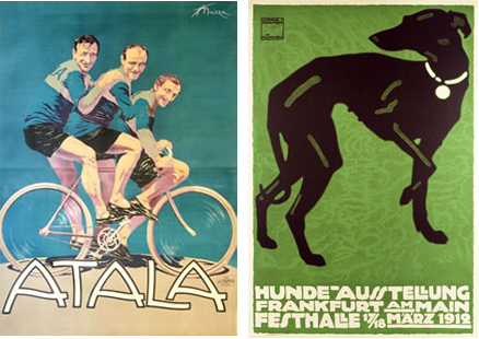
In the 1910 bicycle poster (below, left), Aldo Mazza repeats the blue background color in the biker's jerseys. This controls the pictorial depth, flattening the picture plane. The bikers appear to be pressed between two planes of glass. The depth is that tight. Notice the modulations in the background color—the light-blue on the left seems closer than the darker-blue on the right, enveloping the bikers.

The background and foreground colors are very similar in these posters, tightening the plane to a shallow depth of field and flattening the image.
Whippets are thin, but the whippet in the poster above (right) is paper-thin. The green highlights on the dog press it onto the green background. The green background has a subtle pattern, which softens it. A brighter green would expand forward too much. The white dog collar and the white lettering are shifted to the top, but just a touch. Everything is on very close planes.
Movement and Rhythm with Plasticity

The alternating colors, squares, and patterns create a visual rhythm.
The forward/backward movement created by plasticity generates visual rhythm.
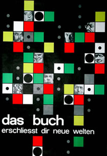
In the photomontage on the right, the designer alternated the red squares, green squares, and gray squares, moving the eye around the canvas.
There are several pairs of opposing planes at work here, pushing and pulling against each other. The red squares pop out the most. Most of the greens are shifting back, but a few of the greens are expanding forward, depending on what color they are adjacent to. The small gray dots prevent the black background from sinking back too far.
The movement is much more static in the Web page layout below; the eye gets stuck on the green square, and that's it, end of story. The designer could have created a more engaging design by repeating the green in different spots on the page.

The green square is an immediate draw, but nothing else draws attention back from the square. The viewer is stuck on the brightest spot in the composition.
You don't want one element to pop out too much, especially something that's not important. Alternate bright and dull colors around the canvas, balancing the high-contrast colors and the low-contrast colors.
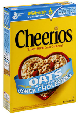
Plasticity Case Study: Cheerios
Plasticity is highly valued in packaging design, where the placement of each element is crucial.
This Cheerios box is beautifully balanced. Nothing jumps out too much. The shifts in space are very subtle, within a narrow depth of field.

What's not to love about Cheerios? The design is crisp, clean, and balanced.
Here are the shifts that I see in the design:
- The bright yellow background contains all the elements on the box. If the yellow were softer, everything would jump forward.
- The black Cheerios logo is beveled slightly, lifting it just a fraction of an inch over the yellow background.
- The red cereal bowl is the focal point. The warm red hue expands forward, but the overlapping blue ribbon holds it back.
- The gradient on the blue ribbon softens the color, so the vibrant blue doesn't advance too much.
- The yellow Whole Grain tagline and the yellow wheat icon are pushing forward slightly, while the white General Mills logo and Guaranteed tagline are shifting back. The black shadow under the white check mark brings it forward.
- The white stripe under the blue banner is beveled slightly, placing the blue banner on top of the yellow background.
That might be too much to think about first thing in the morning. I hope you've had your coffee…
Plasticity Case Study: Starbucks
This Starbucks package uses flat, solid shapes, but there is still a lot of pictorial depth.

Starbucks: The shape may be flat but the design is anything else!
What shifts do you see here? I see that:
- The bright-orange expands forward. However, the overlapping, transparent lettering modulates the orange background, maintaining the plasticity. The left-edge of the box is pushing back, the solid color in the center pulls forward, and the middle-right edge pushes back.
- The orange rectangle's hand-painted bottom-edge overlaps the brown banner across the bottom of the box. This places the brown banner firmly behind the orange.
- The brown coffee cup is a paler shade of brown. The pale value blends with the orange. If the brown coffee cup were darker, it would drop back too much, creating a hole in the center of the box.
- The white type expands forward, clearly legible against the dark background.
To see these concepts in action one more time, check out this Review Kit on color relationships.
Back to Top
I hope you've enjoyed these optical experiments. Now it's time for you to experiment on your own!
