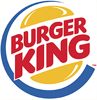
Interestingly, Burger King's logo (and that of its competitor, McDonald's) incorporates a primary triad, to evoke a fun, simple eating experience. Or maybe to appeal to kids?
The Secondary Triad
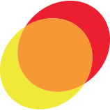
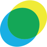
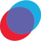
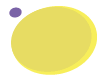
Orange, green, and violet make up the secondary triad. These colors are the sum of two primary colors: yellow mixed with red makes orange; yellow mixed with blue makes green; red and blue makes violet.
Yellow + Red = Orange
Yellow + Blue = Green
Red + Blue = Violet
It should be noted that when we are talking about color mixtures here (combining yellow and blue to make green, for example) we are referring to how colors are mixed in the physical world by combining pigments like paint or printing ink. This is quite different from how colors are mixed in digital programs on your computer screen, which we'll explore later in the course.
Note
Red, yellow, and blue can't be mixed from other paint pigments.
An inverted triangle connects the secondary triad on the color wheel:
Orange, green, and violet are naturally harmonious, but not as pure as the primary triad. There is more of a surprise to this combination, and maybe a little mystery.
Secondary colors create a subtle combination.
Tertiary Colors
Combining a primary color with one of its secondary colors produces a tertiary color.
For example, yellow-orange is built from the combination of the primary yellow and its secondary orange. Yellow-green is built from the combination of the primary yellow and its secondary green, and so on.
To show these relationships, we can use two triangles:
There are two triads of tertiary colors. The name of the primary always comes first (blue-green or yellow-green, for example).
Put all of the primary, secondary, and tertiary colors of the wheel together, and you get a Crayola crayon box.
Analogous Colors
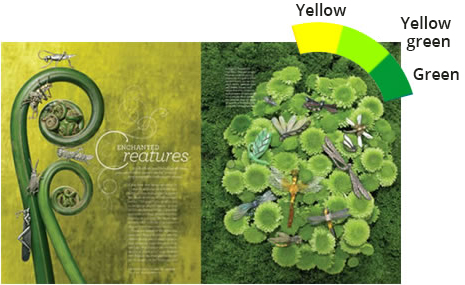
The term analogous colors refers to colors that are adjacent to one another on the color wheel. Three neighboring colors make up an analogous color scheme:
Analogous colors are similar in hue, creating a smooth transition from one color to the next. In the spreads below from Martha Stewart magazine, the gentle transition from yellow to yellow-green to green is pleasing to eye.
Note
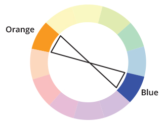
Analogous
colors are located side-by-side on the color wheel; complementary
colors are straight across.
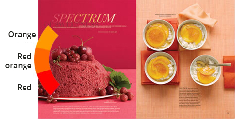
Analogous color schemes create a strong mood, as with these warm reds and oranges:
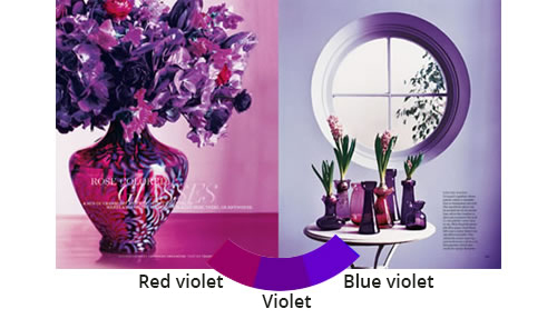
And romantic violets:
Note
Analogous colors are located side-by-side on the color wheel; complementary colors are straight across.
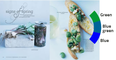
Or cool greens and blues:
Complementary Colors
Complementary colors (also called complementary pairs) are any two colors that are directly opposite one another on the color wheel:
Blue opposes orange on the color wheel. The two colors couldn't have less in common. Orange is warm and light, blue cool and heavy. But as they say, opposites attract. Complementary colors work so well together that you'll see them repeated over and over in all kinds of designs.

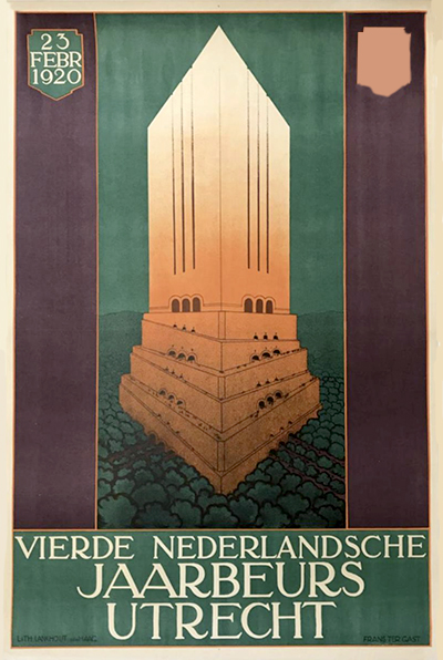
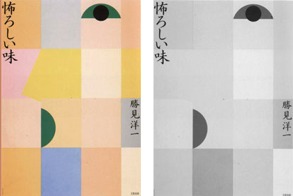
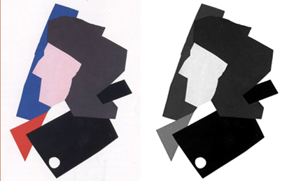
Color opposites work together to create well-balanced layout, as in the contemporary magazine cover on the left and the historical Russian poster on the right.
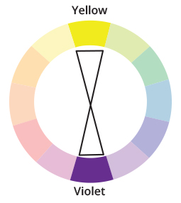
Yellow and violet form another complementary pair:
Unlike analogous colors, complements create strong graphic contrast. If you want to make people stop and look, use a pair of complements.

Complementary colors make these pieces stand out amongst the rest.
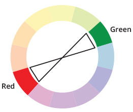
Red and green are possibly the most famous complementary pair, made ubiquitous by Christmas.
The red accents in the magazine spread from Bon Appetite (below, left) give it extra punch. A similar effect is seen in the historical example (below, right). As you can see, these schemes are classic.
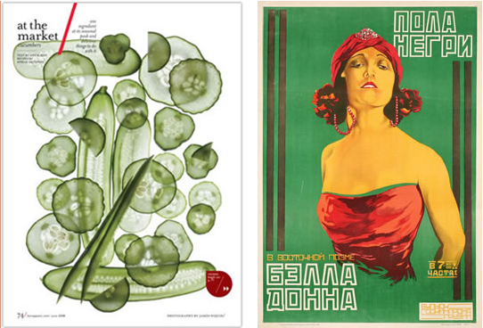
A splash of color from green's complement, red, gives these pieces zip without looking like Christmas holiday ads.
Complementary colors are not for the faint of heart. If your project requires a softer, more soothing style, you might choose an analogous color scheme instead. It depends on the effect you want to make.
Check out the following video tutorial for an in-depth look at the color wheel.
Back to Top
Color Systems: Value
To delve deeper into the world of color, let's explore the concept of color value.
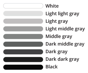
A color's value simply describes its lightness or darkness.
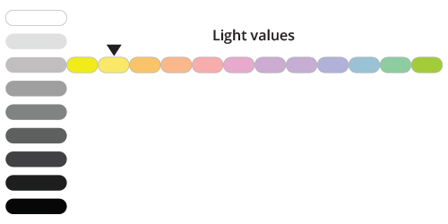
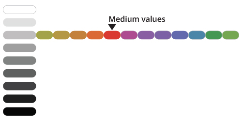
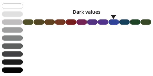
This is a value scale from white to black with a range of seven grays in between.
Adding Color
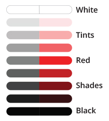
Below, you'll see a value scale for the color red. A value scale is monochromatic, meaning "one color."
Note
Tints are created by mixing colors with white; shades are created by mixing colors with black.
At the center of the value scale is pure red, the hue. To change its value, add black or white.
A tint is what you get when you mix a color with white. Moving up the scale, we add a little more white to each square, creating tints of the original
hue. Light red, or pink, is actually a tint of red. Tints are also called pastels.
A shade is what you get when you mix a color with black. Moving down the scale, we add a little more black to each square, creating what are called shades. Dark red, or burgundy, is really a shade of red.
Note that the gray scale next to the red value scale shows how the different values of red would translate into, say, a black and white photo.
Identifying Color Value
Each hue on the color wheel has a different inherent value. Yellow is a light value hue. A pure yellow would be the same value as a pale blue.
Red is a medium value hue. A pure red would be the same value as a medium-dark yellow.
Blue is a low value hue. It would be equivalent to a very-dark yellow.

Look at your work in grayscale mode. A strong color scheme will look good in black and white as well as in color.
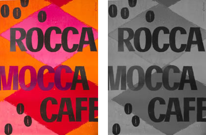
To check color value, convert to grayscale in your image editing program (Image > Mode > Grayscale in Photoshop). This removes the color, leaving behind only value.
Compare the color and grayscale images below. The pinks and oranges are the lightest values. The red translates to a middle-gray. The dark coffee beans and lettering are the darkest values, creating a pattern on top.
Examining Value Contrast
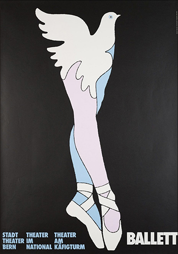
Strong value contrast creates visual impact. In this poster by Heinz Jost, the white ballerina is placed against a black background.
The illustration would still be pretty, but not as exciting, against a white background. Without value contrast, the feeling is calm and static.
Use value contrast to emphasize important elements. In the poster below, Ikko Tanaka used value contrast to make the eyes, mouth, and chin stand out. But what happened to the nose?
With too tight a contrast range, elements fade in Ikko Tanaka's work.
A rule of thumb is to alternate light and dark values across the canvas. Take a look at this illustration by Ivan Chermayeff:
Ivan Chermayeff's illustration of a face holds up in grayscale by alternating values between dark and light.
The values in the example above alternate (dark/light/dark/light/dark) creating a visual pattern. The contrast helps your eye define one shape against the next.
Choosing the Right Contrast
Depending on the concept of your project, you may decide to use high value contrast for maximum impact:

This cover of New York magazine will certainly make you look! The high contrast is striking.
Or low value contrast for a softer feel.
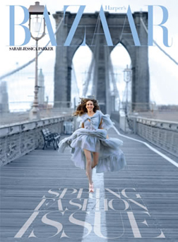
The low value combinations of this Bazaar magazine cover are like a soft spring breeze.
In the New York Times magazine spread below on disappearing bees, the designer used stark value contrast to alert the reader to the epidemic.
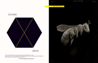
The high value contrast not only brings your attention to the design, but also leads you in to the bees' plight.
This National Geographic photo has a much softer, more comfortable feeling. The values blend smoothly. Even the typography is muted, in pale tones against the blue water.
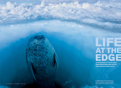
A low contrast layout is soft and subdued, the tones and light quality muted by the water in this seal's natural habitat.
This 1920s Cognac Monnet poster by Leonetto Cappiello features a lightly clothed dancer against a dark background. Maximum contrast adds an element of surprise. It looks like a fabulous party.
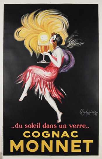
High contrast can also imply activity beyond the light, like the party in Cappiello's Cognac Monnet poster.
The mood is much softer, calmer, and more introspective in this theatre poster by Max Bill.
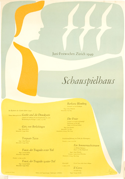
The mood of the play is set by Max Bill's low contrast theater poster.
Back to Top
Color Systems: Intensity
Pure, richly saturated color is undeniably beautiful, but the effects can be overwhelming. You can dilute color for a softer effect.
Note
A color's saturation refers to its purity or intensity.
Adding a color's complement is the best way to lower its intensity. Any two complementary colors (opposite from each other on the color wheel) combined at different steps will be reduced in saturation (purity or intensity).
If you have a set of paints, try this out:
| Start with pure yellow. This is the purest yellow you can achieve—straight from the tube. |
 |
| Now, mix in a dot of violet. The result is still yellow, but not quite as bright. |
|
| Okay, add more violet. This almost completely cancels out the yellow; it becomes a neutral beige. |
 |
| Even if you add white to this mix, you can't get the yellow back. The purity of the yellow has been dulled by the violet. |
 |
To mix neutrals on a computer, layer two complementary colors and adjust the opacities. For example, if you layer 80% blue and 40% orange, you'll get a neutral blue.

A pure blue is dulled by adding orange.

A pure red is dulled by adding green.

A pure yellow is dulled by adding purple.
You can create beautiful colors by mixing complements. The intermingling hues create a sophistication that doesn't come straight out of the tube.
Contrasting Intensity
Dull colors are rarely our favorites, but they provide the deep, resonant notes in a color palette. Take a look at this social welfare poster designed by Celestino Piatti (below, left). The pure, intense colors are balanced by dull, neutral colors. The varied degrees of brightness express the concept of
the poster—giving children a better (and brighter) future.
The dull colors with spikes of intense pure colors create an eye-catching balance. The color in these pieces lends a deeper texture than black and white would.
Placing a highly saturated color on a dull background is a great way to create a focal point. In the Mario Sironi poster (above, right), the bright orange explodes out of the dark background. A bright, contrasting color is called a punch color. You can't miss it.
Contrasting bright and dull colors is unexpected and fun. This Havaianas illustration would also look great against a white background, but the dull, dark base color is more interesting.

The dull background makes the bright illustration appear even more vibrant than it is!
Choosing an Intensity
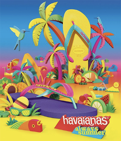
Depending on your client, you'll need to decide how bright—or dull—the intensity level should be. Havaianas' branding image is tropical Brazil—and the vivid, intense colors of the design below couldn't be more on the mark.
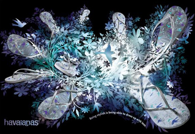
However, when Havaianas launched a marketing campaign in New York, it switched to a neutral, low-intensity color scheme more appropriate to the urban setting. The new tagline "Being stylish is being able to dress up with less" implies the sophistication of gray and black:
Colors are very expressive of their environments. Mexico (below, left) makes you think of pure, primary color, whereas Zurich (below, right) is more understated. The faded browns imply a sense of history. The olive-green and dusty-rose accents colors are lovely against the neutral background.
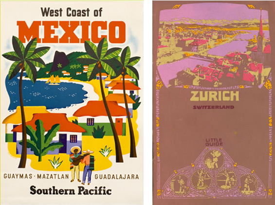
The bold palette emulate the bright colors of Mexico, and the subtle browns suggest Zurich.
Bright, intensely saturated color has a youthful feel in this magazine spread:
With age, colors fade, revealing subtle undertones, as in this spread:
Comparing Value and Intensity
Value and intensity are easy to confuse. Usually we think of dark colors as dull, but that's not necessarily true.
These dark colors are richly saturated:
On the other hand, a dull color is not necessarily dark. These dull (low-intensity) colors are light in value:
Intensity is the purity of color, while value is its degree of lightness or darkness.
Imagine you are using an artist's color palette. If you paint an apple with red paint straight from the tube, the color will be highly saturated. It won't look like a real apple. To lower the intensity, add a dot of green. It will fade to a less saturated, more natural red. To change the apple's value, you would add either white (a light red apple) or black (a dark red apple).
To summarize what we've learned so far, every color has three properties:
- Hue: The base color (where it is on the color wheel)
- Value: The lightness or darkness
- Intensity: The dullness or brightness
To identify a color, consider its hue, value, and intensity.
Back to Top
Color Harmony
Now let's explore some principles for combining colors. Why are certain color combinations pleasing to the eye, while others remind us of our uncle's holiday sweaters?
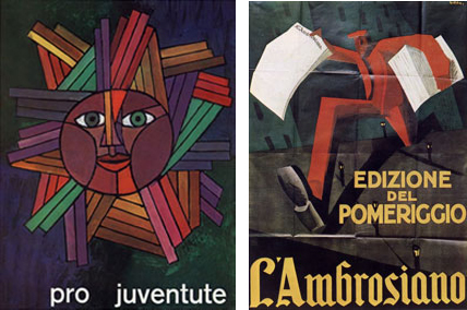
When art psychologist Rudolf Arnheim explained poet Goethe's theory of color harmony, he argued that since the primary triad of color contains all the colors of the spectrum, it thereby creates white light and evokes divinity. He thought that red, blue, and yellow together strikes a chord in us by suggesting the presence of God.
Wherever color harmony comes from, we certainly know how to create it. Color harmony is achieved by using colors derived from a geometric equivalent on the color wheel. Remember all those geometric shapes at the beginning of the lecture? Here's where they come into play.
In theory, all the colors in the color spectrum must be present to create harmony. To ensure you've got 'em all, use a triangle, square, or rectangle to select colors from the color wheel. I'll show you how in just a moment.
Learning color theory is like learning music harmony; it's best to understand the rules before you break them.
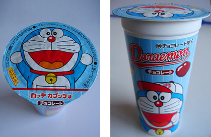
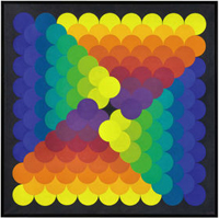
Remember the primary triad that we used to kick off the lecture? Here it is in a Japanese snack food package design with all three colors in harmony.
Color discord (the opposite of harmony) is created by using colors
with no geometric equivalent or ordered relationship. Using this method can result in unusual and interesting color relationships!
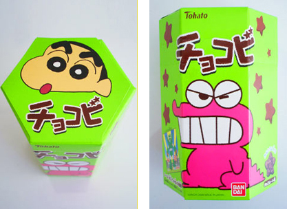
This package is an example of discordant color.
Take a look at the food packaging examples above. The blue, red, and yellow package is a primary triad color scheme—perfect harmony. In contrast, the lime-green package clashes terribly. It doesn't look as healthy as the top package, but it certainly would be noticed in the grocery store.
The notion of harmony and discord in color can also be compared to music. Color harmony is like listening to a piece of "light" classical music such as Pachelbel's Canon: all is order, symmetry, and comfort.
Color discord is like sitting on a piano keyboard and noodling around without
worrying about traditional chords or melodies. Aside from sounding strange, there is nothing catastrophic about about playing the piano this way. Some people like musical disharmony just as some like color discord!
Getting into Shape
Let's take a look at how to use geometric shapes and the color wheel to create
harmony (or its opposite).
The color wheel can be used to pick colors that are harmonious or discordant.
An equilateral triangle, as formed by the primary triad, can be rotated around the interior of the circle to form triads of color. This
illustration depicts a triad of yellow, red, and blue. See if you can envision
what some of the other triads would be.
Any complementary pair is harmonious. We've already looked at several classic complementary pairs like yellow and violet, but other combinations such as yellow-orange and blue-violet are equally beautiful.
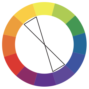
An isosceles triangle, also known as split
complements, is formed by any two complementary colors using one complement and the two adjacent tertiary colors of the other complement. This also creates color harmony:
And, of course, you can rotate this triangle to create other combinations.
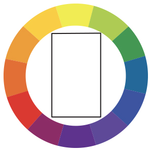
Tired
of three-sided shapes? A rectangle creates
another harmonious color relationship because it uses the adjacent
tertiary colors of any complementary pair. (Is your head spinning from all these imaginary rotations?)
Finally, you can use a square to create
harmony. On the color wheel, a square is constructed by combining
a pair of complementary colors with a set of tertiary complements.
In
the example above, yellow and violet are one complementary pair and red-orange and blue-green are the other. Together they form the geometric square, which is harmonious.
Now take a deep breath and say "OHMMMM."
How is color harmony applied to design? Let's take a look before moving on to the exercise:
Back to Top