Speech Balloons
Speech balloons, also called word balloons and speech bubbles, are an efficient way to show that someone or something in your cartoon is talking. While most of the focus should be on your artwork, the style or shape of your speech balloons can play an important role in making your final art looking polished.
Most speech balloons share some components: a balloon, some text inside, and a tail or arrow that points to the person speaking. Nevertheless, how the speech balloon is drawn can help you emphasize the tone of what is being said. Sometimes the shape of the balloon can provide as much information as the text itself.
Let's go over some examples and explore how they help convey what the characters are saying.
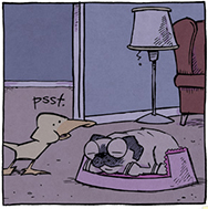 |
Whisper
In this panel, the lack of a speech balloon and a small, lowercase "psst" implies that the duck is using a hushed whisper.
Image from Sheldon by Dave Kellett |
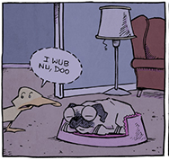 |
Soft Voice
In the next panel, the duck has a speech balloon, but a broken outline suggests he is speaking slightly louder. |
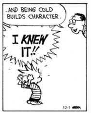 |
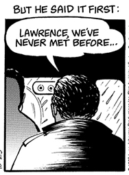
Shouting
Calvin's dad has the traditional speech balloon, but the jagged line and boldface lettering on Calvin's speech balloon gives the impression that he is shouting.
Image from Calvin and Hobbes by Bill Watterson |
 |
Thought
To represent a person's thoughts, a thought balloon is drawn like a cloud, with a series of circles acting as the tail of the balloon.
Image from Monty by Jim Meddick
|
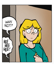 |
Laughing
The lower balloon from the person behind the door has a wiggly line containing a "hee hee hee" suggesting playfulness.
Image from Luann By Greg Evans |
 |
Broadcast
A balloon with a tail that is jagged and pointing to a television, radio, or computer indicates that the voice is being broadcast from a device.
Image from Doonesbury by Garry Trudeau
|
 |
Caption or narration
Text that exists in a square shape with no tail is considered a narration or a caption keeping the reader informed of what is going on.
Image from For Better or For Worse by Lynn Johnston
|
Of course, this is a technique that should not be overdone. Unless you are creating an action-packed comic, you want to use non-standard speech balloons for emphasis. And as we have discussed in earlier lessons, the poses and physical interactions of your characters should communicate clearly and have as much impact as your text.
Nevertheless, your speech balloons can speak volumes, so think about using them intelligently. There's no wrong way to do it, just better ways, so when you craft you stories, consider the effect your characters' words and thoughts can have on the reader. (Scott McCloud's books Making Comics and Understanding Comics are both great books for exploring speech balloons.)
Speech Balloons in Your Composition
It is important to consider the presence and placement of word balloons when you are composing your images. You don't want your word balloons overcrowding your artwork or covering up an important aspect of the image.
A good practice to get into the habit of doing is to plot out where your text is going as you rough out your strip. This way, you treat the word balloons as part of your image composition and you're less likely to run out of room.
 |
This is a strip from my webcomic ChickPeas. Notice how I gave special attention to the placement of the speech balloons, even before I inked in my artwork. |
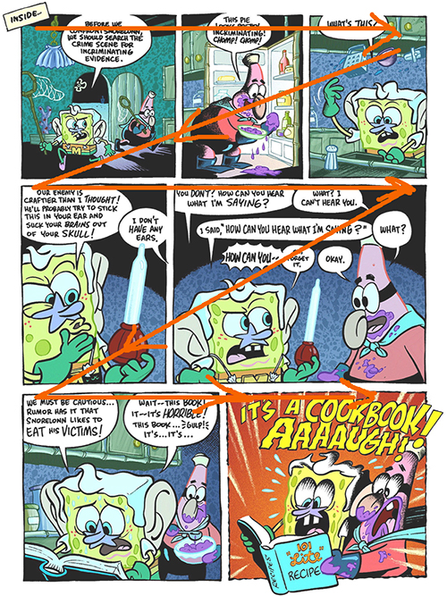
Speech balloons are also a great tool for guiding the reader's eye around the page. Since you know that the reader is going to be focusing on the speech balloons first, you can place them strategically around your images and direct the reader. This can lead the reader to see certain details and you can even use balloons to hide details you want revealed later.
Comic Strip Layout
Another important point to keep in mind is how your audience is expecting to read your story. Generally in the Americas and Europe, we read our comics from the top left to the bottom right.
While in Japanese comics, they start from the top right and go to the bottom left.
There's nothing right or wrong about either of these approaches, and feel free to experiment with both ways, but keep your work consistent. It's not fun to read a comic where the author keeps changing which part of the page you should start reading from.
Lettering
The lettering in your word balloons should be clean, uniform and easy to read. If your lettering is in speech balloons, it should be upper case for clarity. The inked lettering should be written with either a dip pen with a round nib or a technical or micron pen.
Keep in mind that there is a very good chance that your cartoon will be reduced for print publication or online posting. So, make sure your lettering is big enough to hold up after the reduction. If needed, review the instructions on using the Ames lettering guide in Lesson One.
Inking
Before your work is published, it must be rendered using a process called inking.
Throughout the course, you've been creating artwork using a pen and pencil and paper. In order to print the work, the publisher will need to scan or photograph the image for digital printing. The work must be outlined in black ink to create a final piece of art with high contrast and clean lines. It's a technique that requires a lot of practice.
One thing to focus on inking is your line thickness. Generally, thick lines make objects pop out against a background and are best used on objects in the foreground of an image. Thin lines are used for distant objects in the background.
Also, thick and thin lines can describe how light is hitting an object. Shadows and the undersides of objects and characters are best drawn with thicker lines while thinner lines are used for the sides that are facing a light source.
Quick thin lines hashed around and/or inside an object can describe different textures. Take some time to practice drawing quick lines and see what kind of textures you can create.
When I ink drawings, I take into account how much detail I want to add to the drawing first and then decide if I want to indicate any textures that might be on an object or character. Normally I like to keep a balance of dark and light areas because for me I feel that makes the drawings more visually interesting.
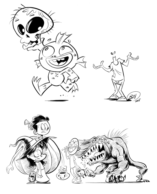
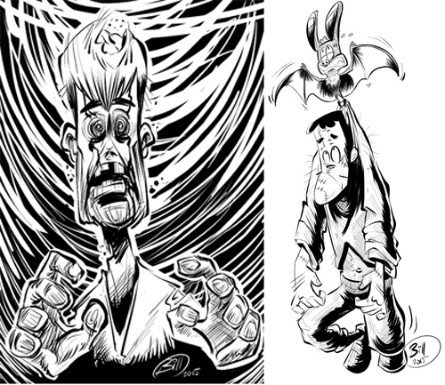
Generally, I don't ink too many details on a character's face because I want them to stand out against the rest of the image and I try to take some account of the lighting available. The more you add details and a contrast of light and dark to your image, the more energy and drama you create. Hence the difference between the fun and cartoony Black Lagoon creature and the dark and disturbing zombie!
Inking for Inktober
The following drawings are from a monthly drawing challenge in October called "Inktober." It's a fun event where you draw one inked drawing a day in October and post it online with the hash tag, "#inktober."
It's a great way to see how other artists are inking and see what techniques they are using. It also allows me to practice my inking skills. These are Halloween based because I was going off a list of Halloween-themed ideas.
Inking is important to fully render an image, but it is not always essential for a strip to be inked. In the project pitch we'll look at later in this lesson, you'll see that I sent out a storyboard in non-photo blue pencil along with my inked character illustrations.
When you are crafting your story, the style of the art you use can affect how the story is viewed and experienced. While much of this course has been focused on creating a story, how you decide to draw it is important.
Heavy inks can create a sense of terror or seriousness, while clean lines and simple lines can convey a sense of innocence that goes well with humor strips. Strips that feature color or are created in different media such as colored pencils, watercolors, or even digital art can all bring different elements to their stories.
I encourage everyone to explore what works best for them as they practice creating stories.
Inking Techniques
So, what are some techniques you can use for inking your final artwork? Let's explore some important methods:
| Inking Glossary |
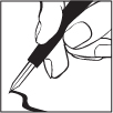 |
The nib is the part of a crow quill or mechanical pen that comes in contact with the paper. When you are creating lines, it's important to understand how different nibs interact with the paper and how they dispense ink. |
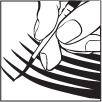 |
Feathering is accomplished by using a brush and starting the stroke lightly and then applying more pressure to the brush to make a thicker stroke. This can give a gradient blend, or shading, to your artwork. |
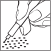 |
Stippling is done with a mechanical pen and applying a series of dots by pecking them onto the paper to create a texture or pattern. |
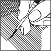 |
Hatching can be done with either a pen or a brush. This technique creates a texture or shadow by drawing a series of parallel lines on a surface in your artwork. Cross hatching adds even more texture or a darker tone. |
Once you have created, planned, developed, roughed out, sketched your cartoon, the time has come to apply the ink to your drawing. Inking will create a bold outline, giving your artwork definition.
Inking Tips
As your skills begin to develop, you will find that inking provides many characteristics to your cartoon art. Let's go over those now.
| Form |
Giving your subject shapes. |
| Light and Shadow |
Understanding the location of your light source and the resulting highlights and shadows. |
| Volume, Mass, and Depth |
Giving your artwork dimension and distance from your subject to its surroundings. |
| Atmosphere and Mood |
Lots of dark ink will create a mysterious and dramatic feel, and holding back on the ink will can create the opposite effect. |
If you choose to use a brush to ink your artwork, have a paper towel or extra sheet of paper next to your bristol board to wipe the brush and drain off any excess ink after your initial dip. Use the movement of your arm to draw rather than flexing your wrist. Always pull the brush and never push.
Rotate the paper around as you apply the ink on your sketch. Be strategic by avoiding areas on the paper that still may be wet. Keep in mind that sketching is fast and furious while inking is slow and methodical.
Here's link to a video tutorial illustrating some effective techniques for inking your artwork if you are interested in further exploring this technique.
Inking Digitally
One approach to inking your cartoon not mentioned in Lesson One is inking digitally. If you have a computer with the appropriate software (Adobe Illustrator, Photoshop, or Corel Painter) and hardware (a pressure sensitive Wacom tablet), you can ink your work on your computer.
The advantage to creating your cartoons digitally is that you could create the text and apply the color in the same program. This gives you a leg up in the production process if you are producing webcomics for Internet publishers.